
Random numbers, facts, or measurements cannot make sense to an individual. To create sense in them, they need to be visualized. It helps present the numbers, facts, and measurements understandably. There are different ways to visualize information, but the best one is through a comparison chart. It can be used to separate numbers from letters. It presents figures in a way that they can be compared against each other or other charts.
Contents
- 1 Comparison Chart Templates
- 2 What is a comparison chart?
- 3 Types of data presentation
- 4 Comparison Table Templates
- 5 Different types of comparison charts
- 6 Advantages of using a comparison chart
- 7 Comparison Graphic
- 8 When is a comparison table template used?
- 9 What is the best comparison chart?
- 10 Product Comparison Charts
- 11 How do you create a comparison chart?
- 12 Rules for data visualization
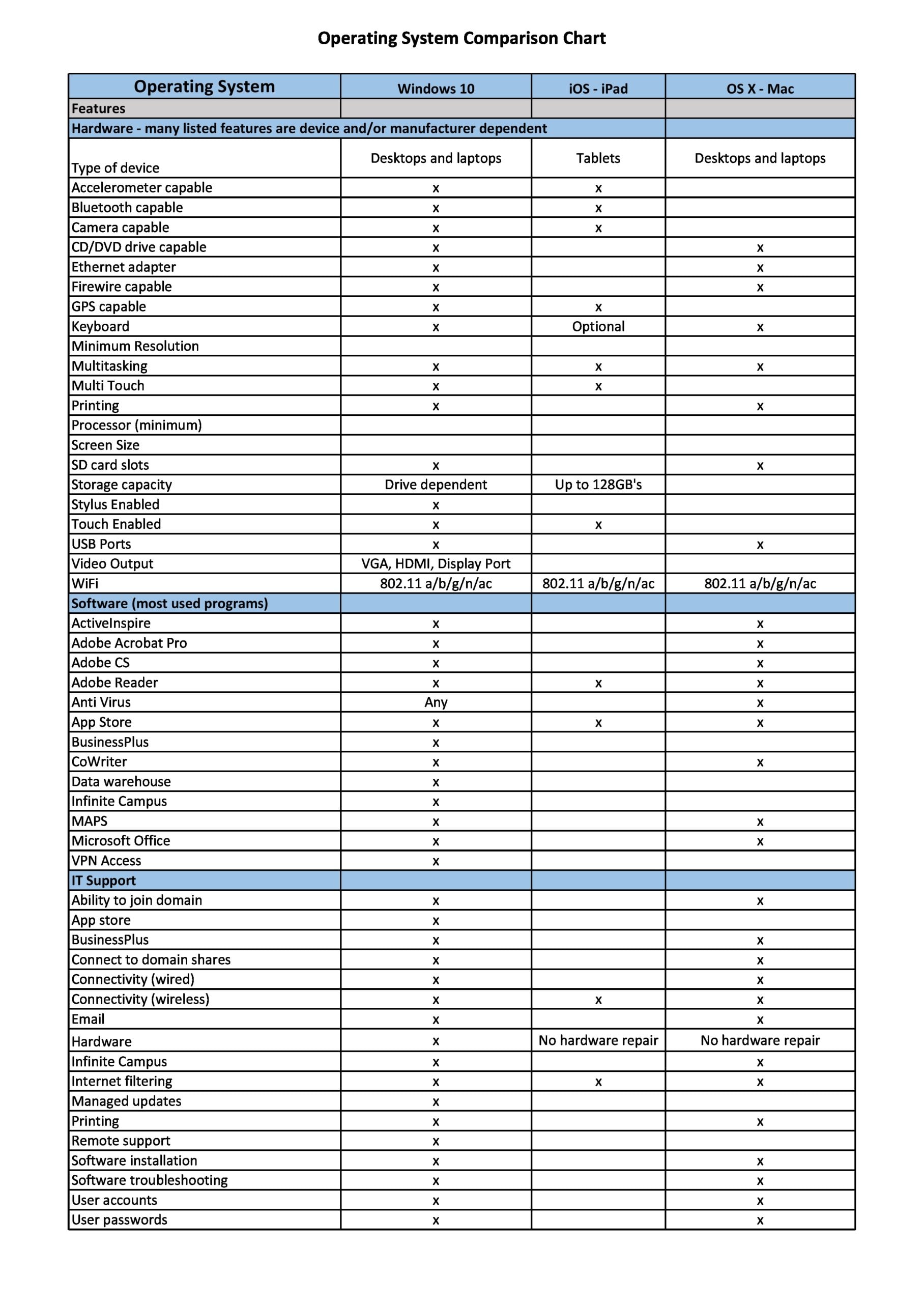
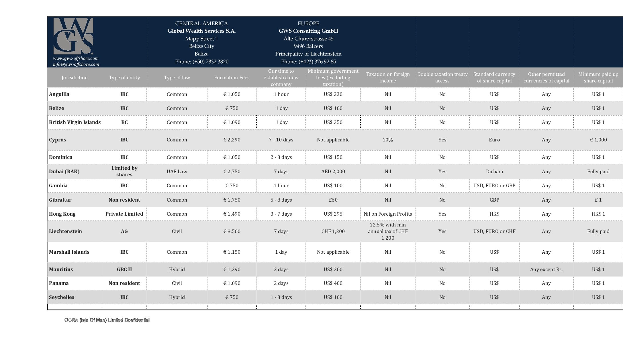
Comparison Chart Templates

What is a comparison chart?
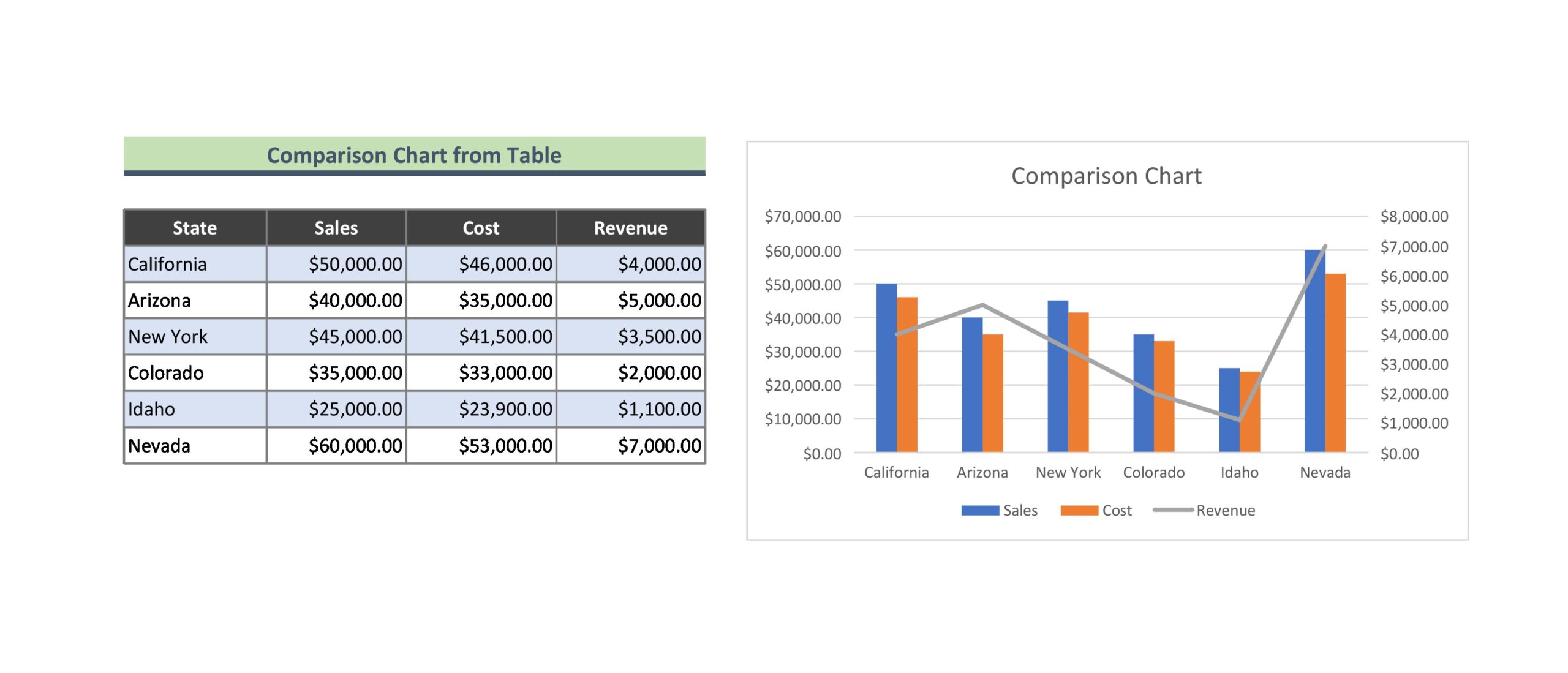
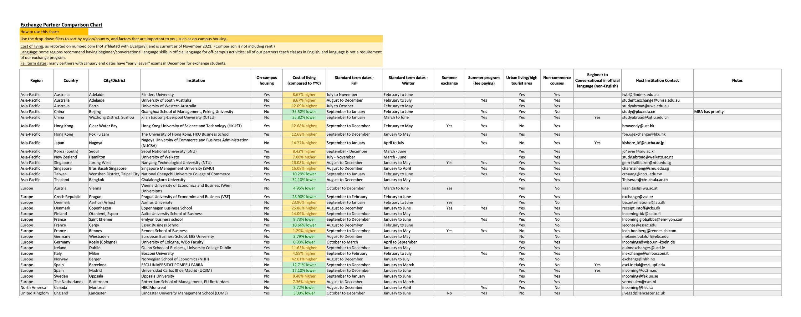
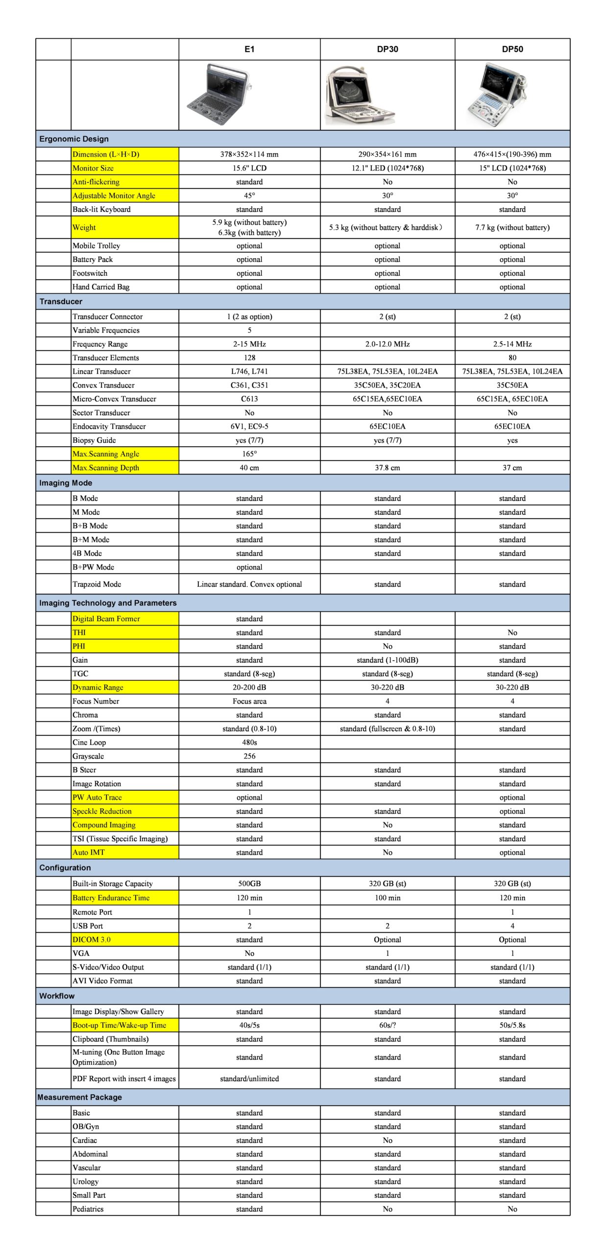
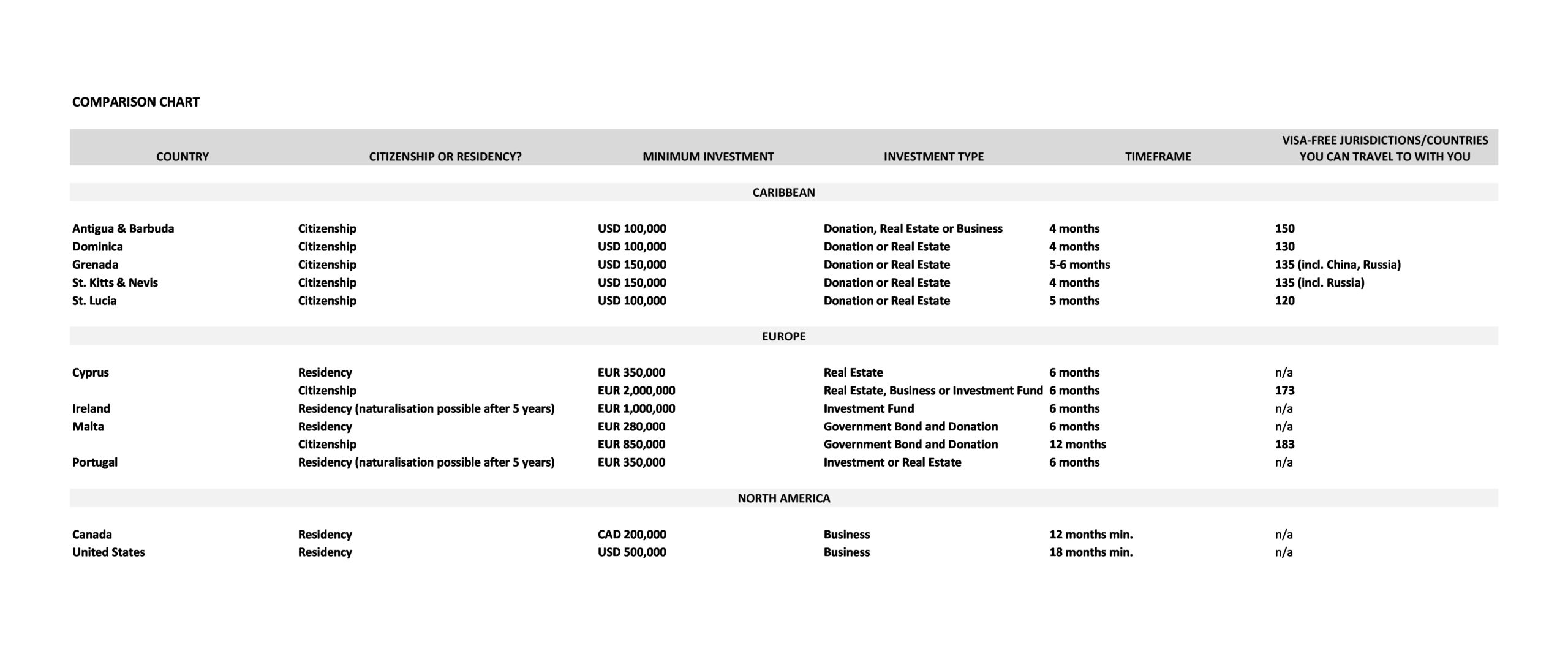
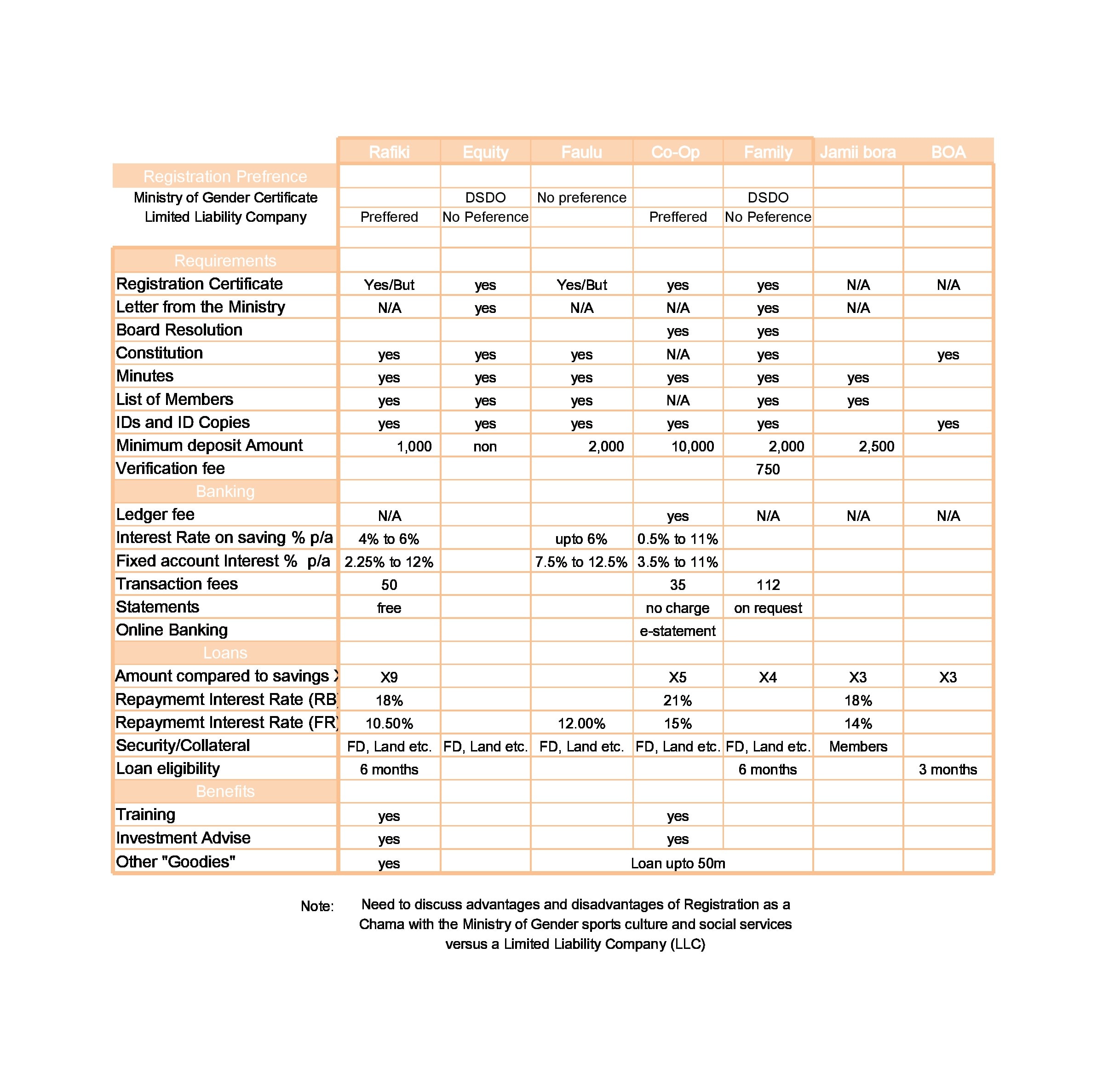
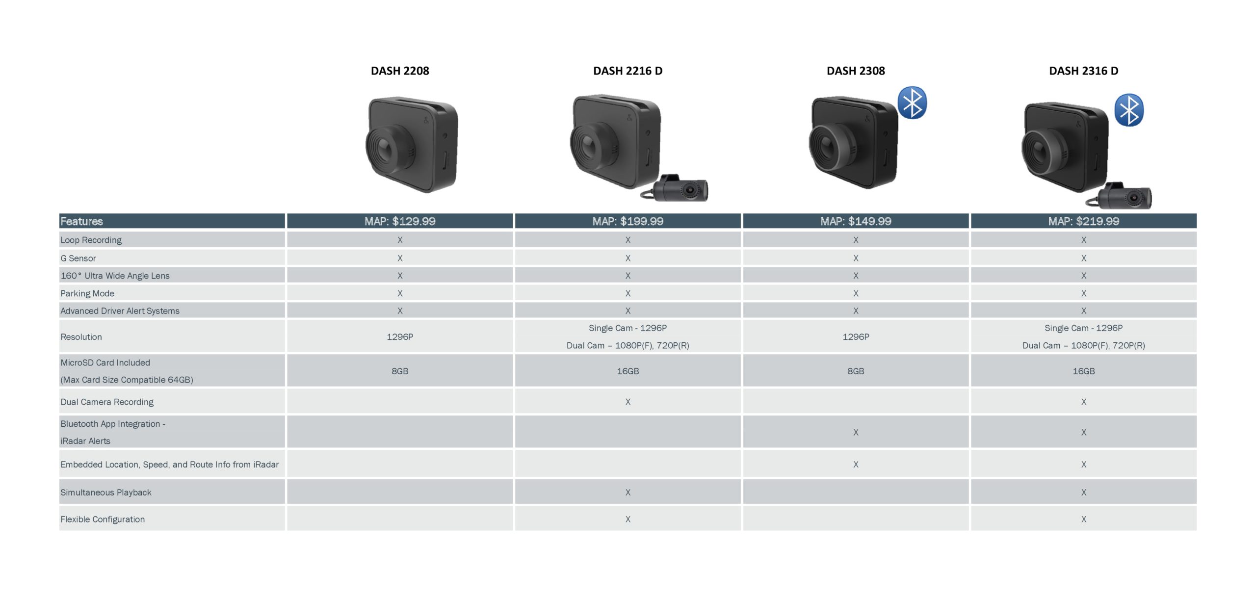
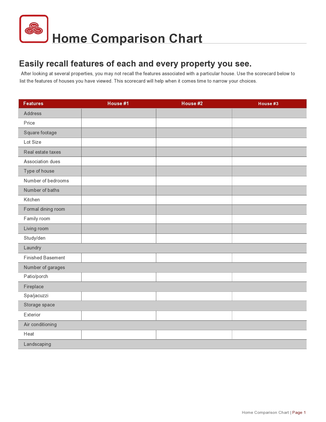
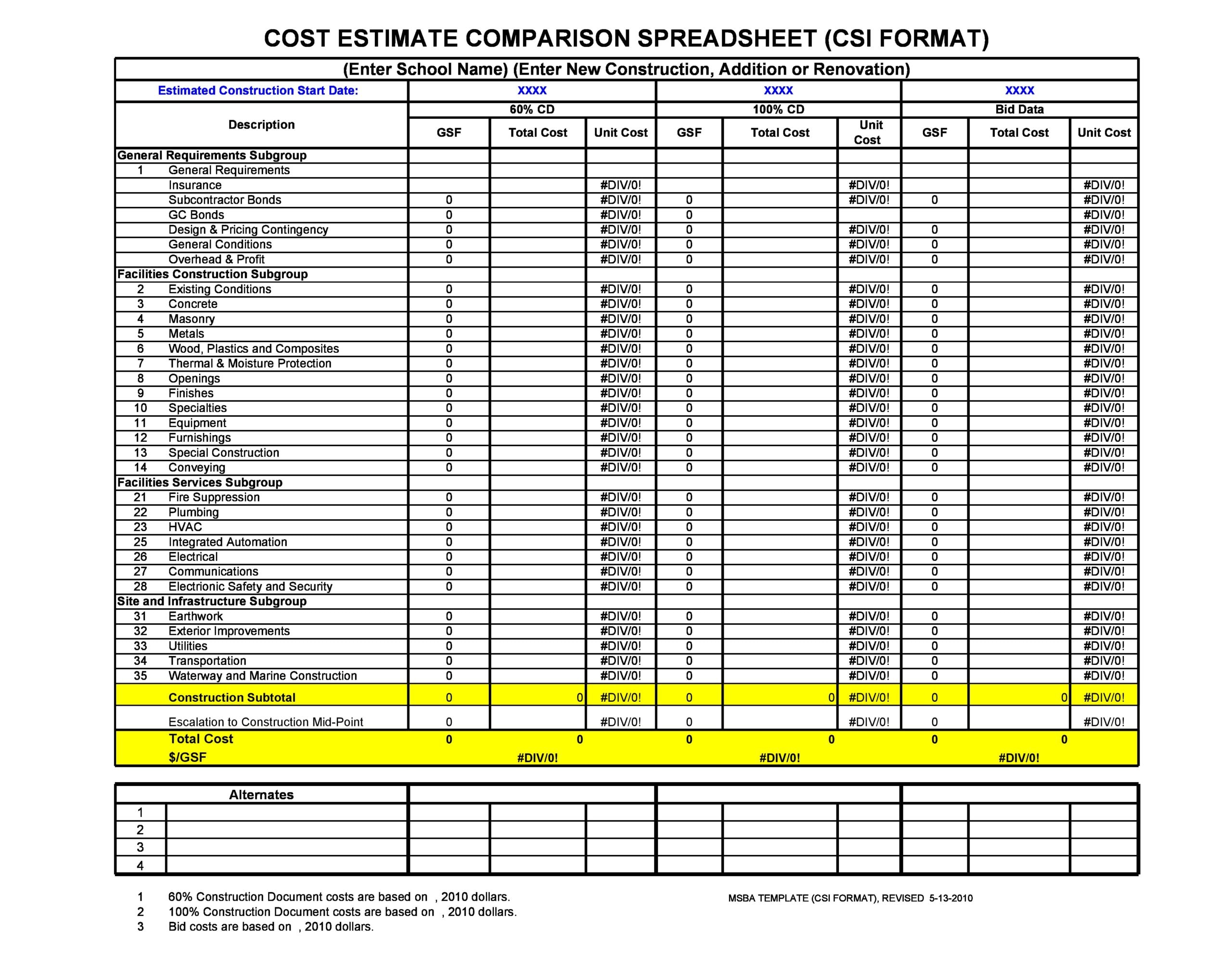
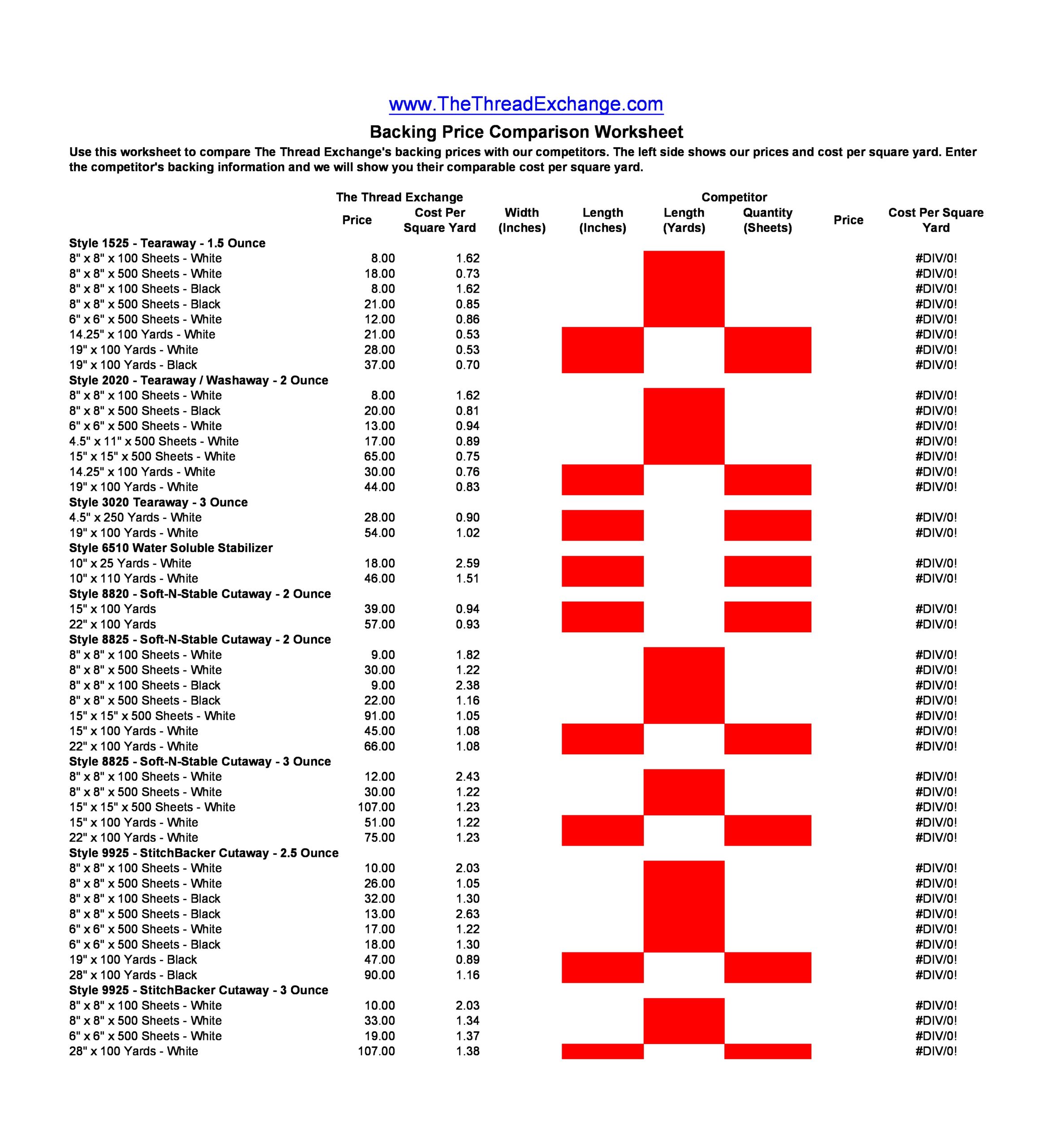
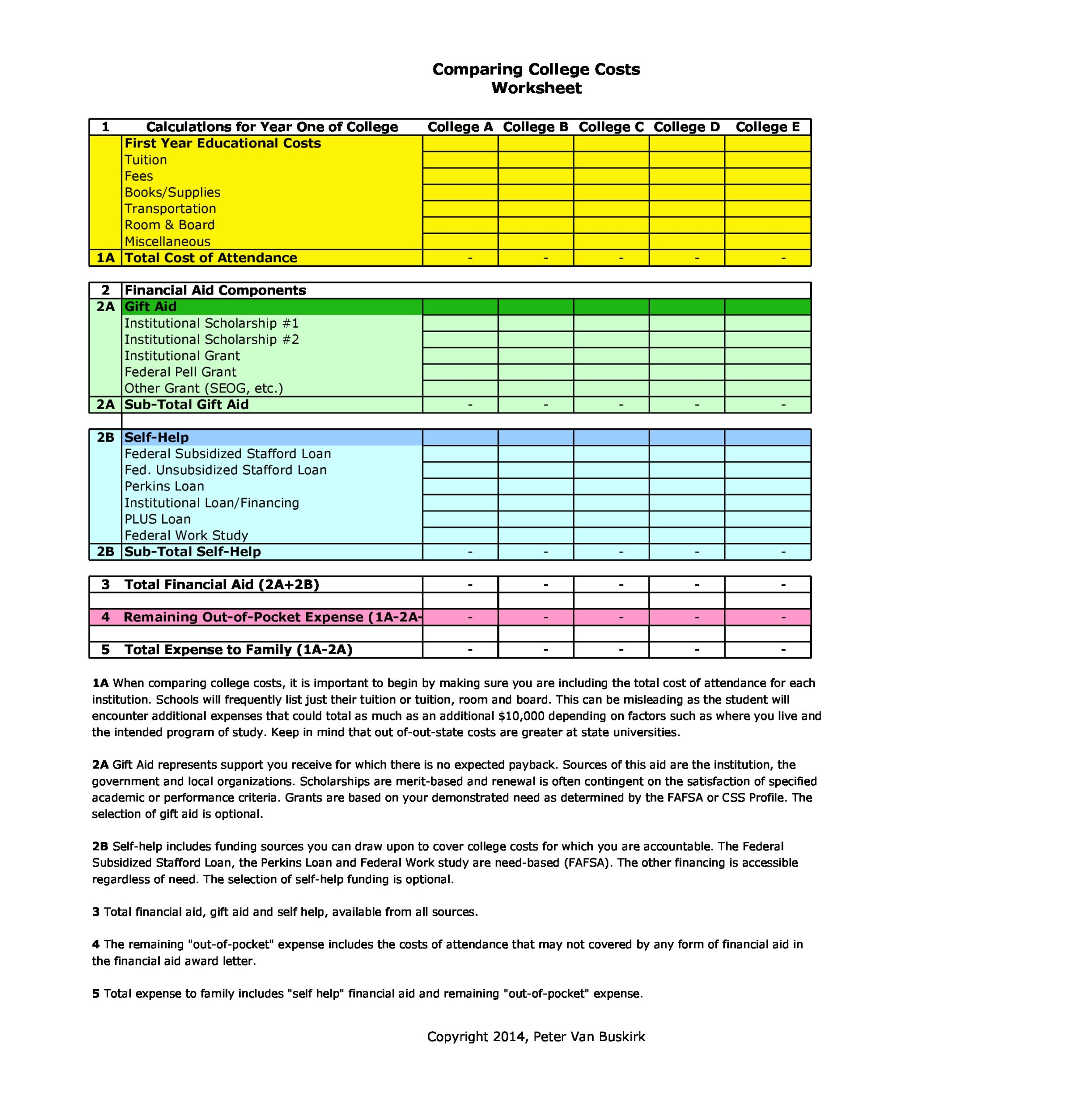
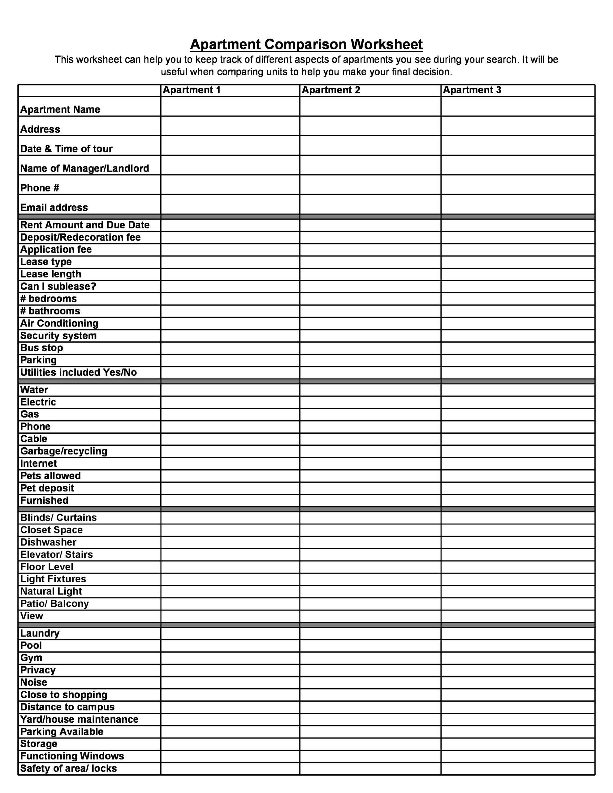
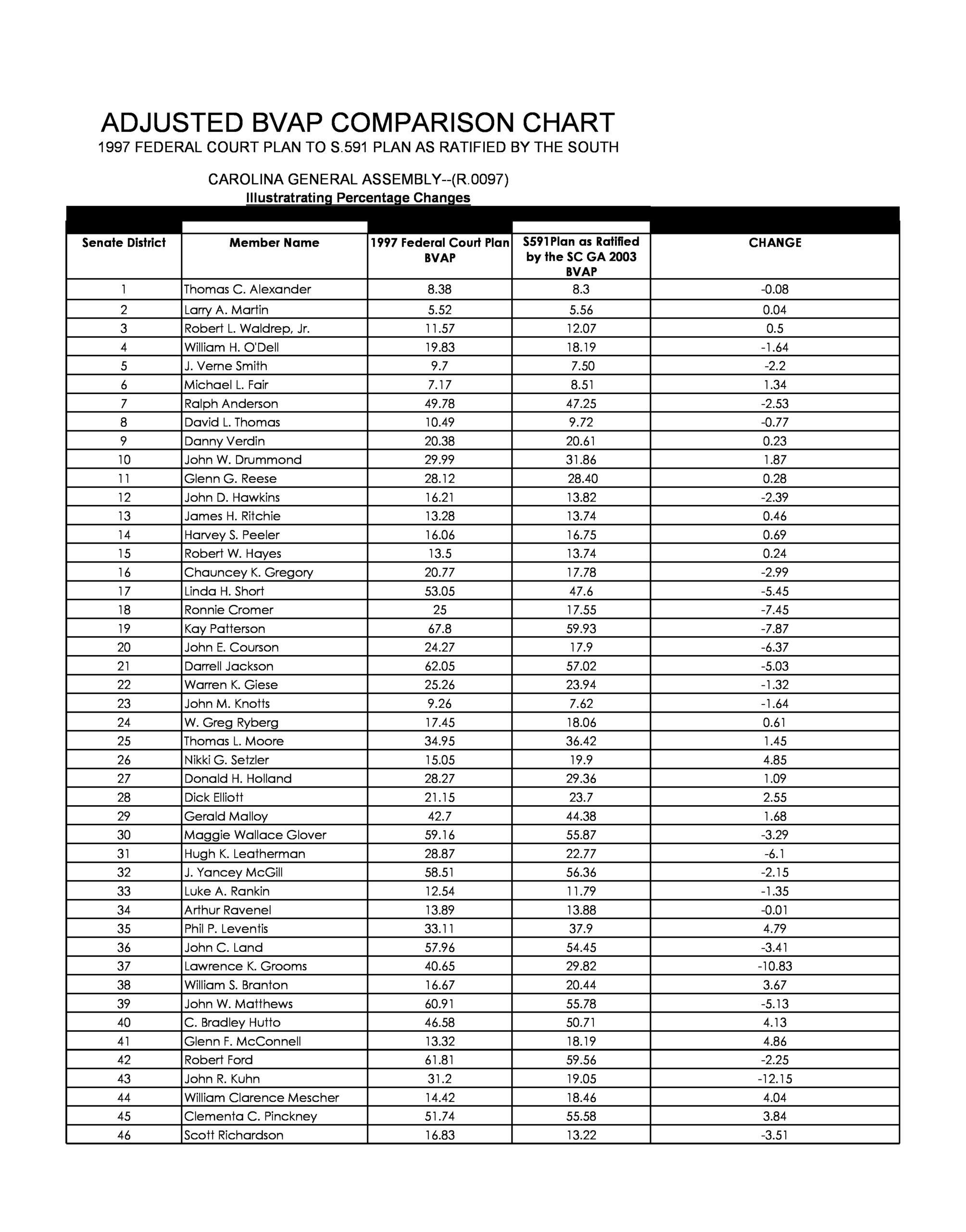
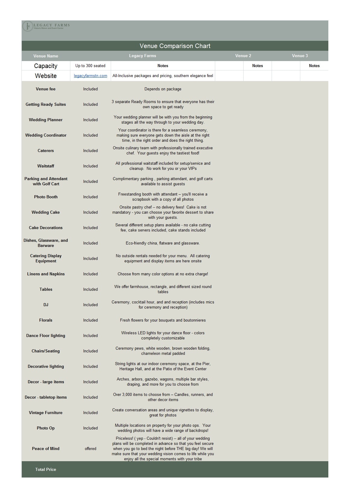
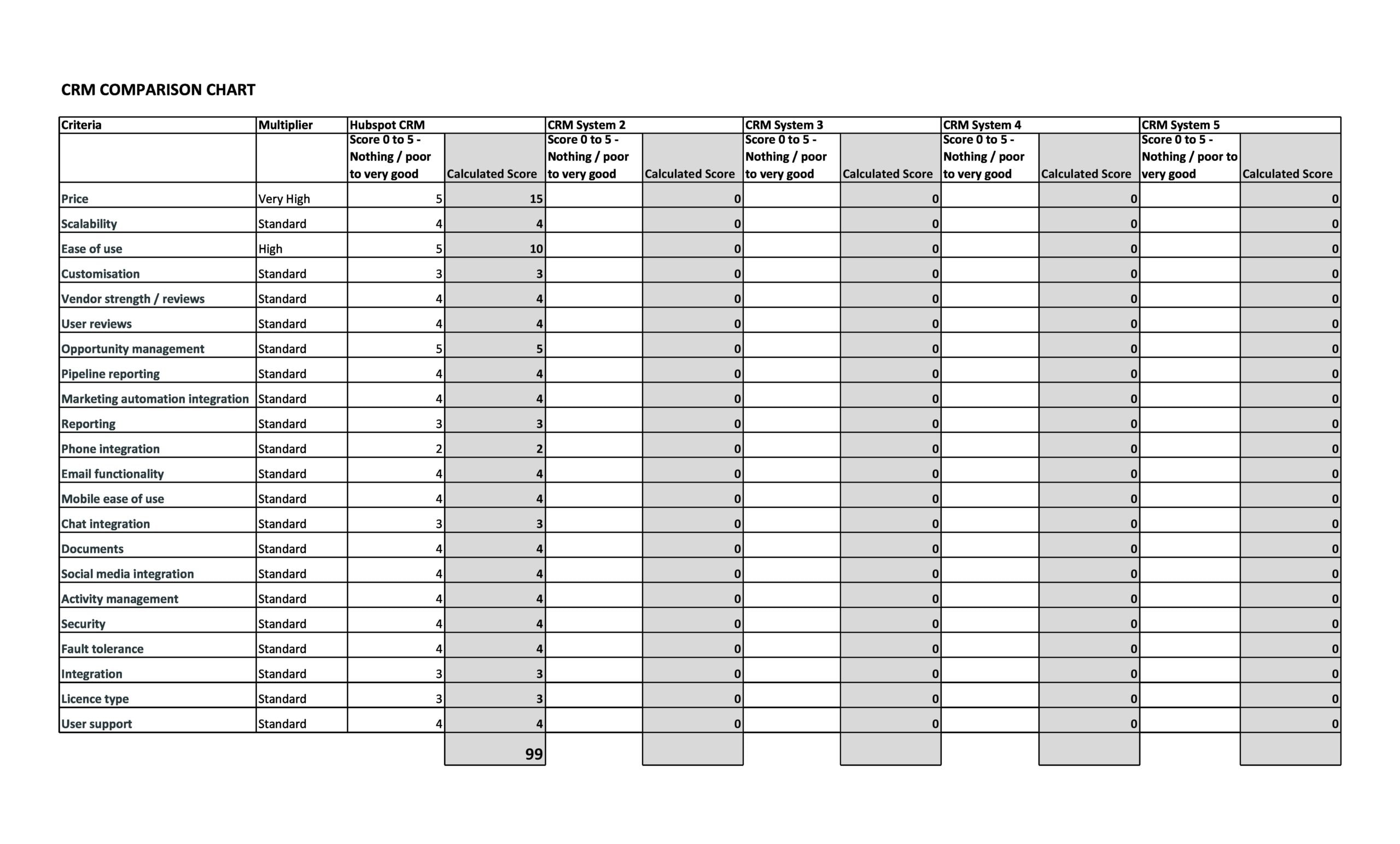
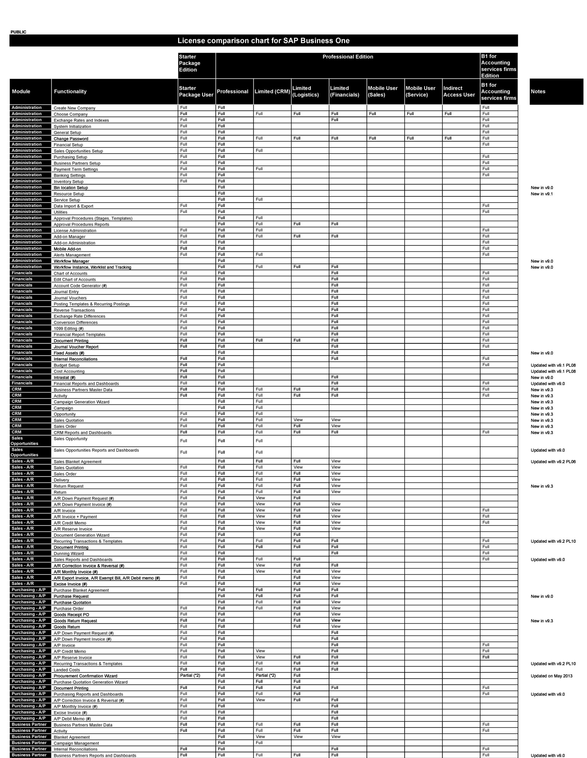
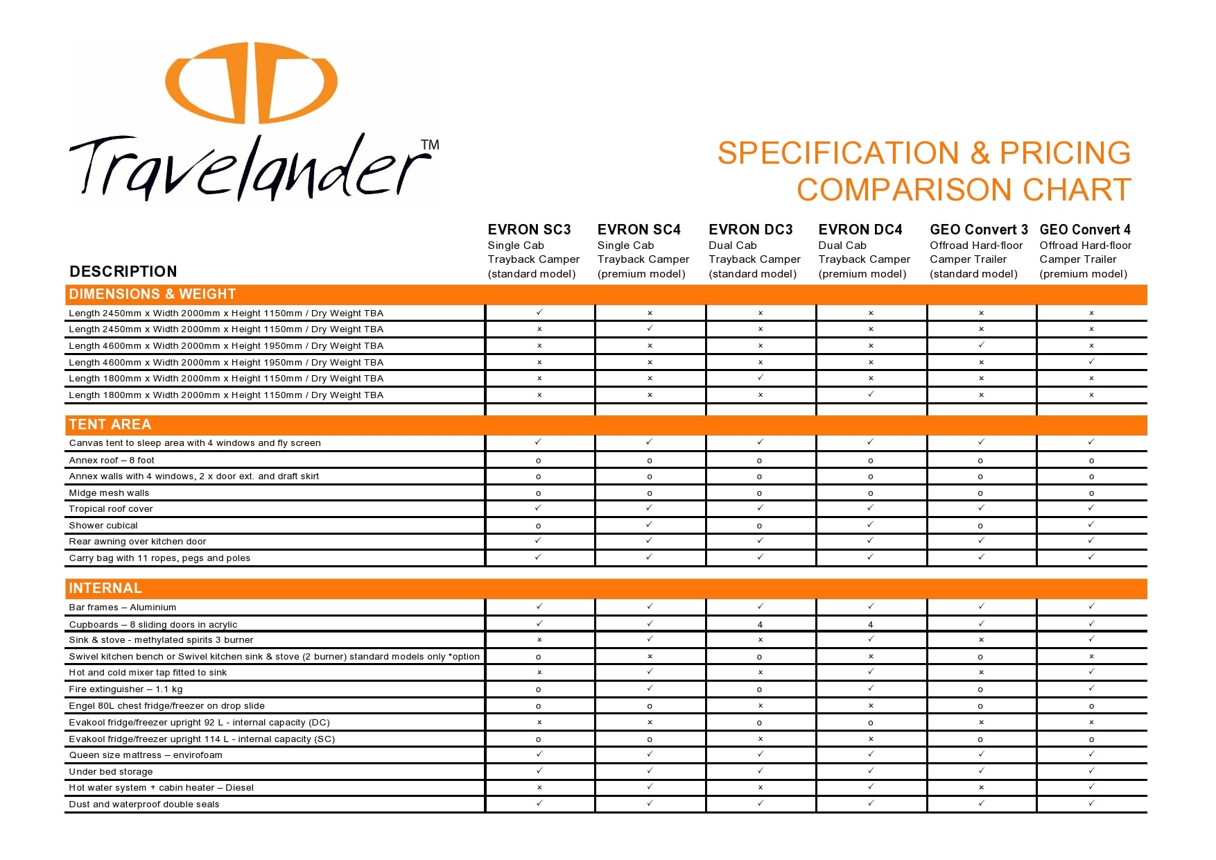
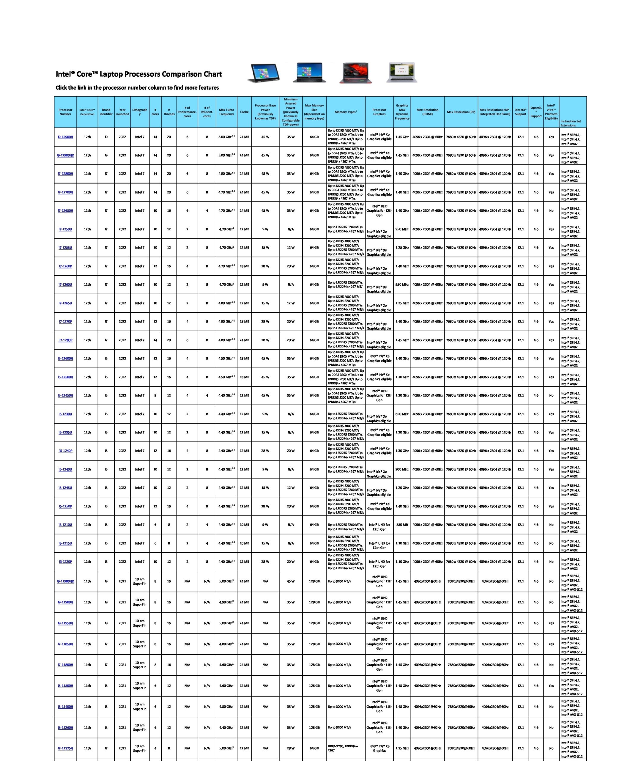
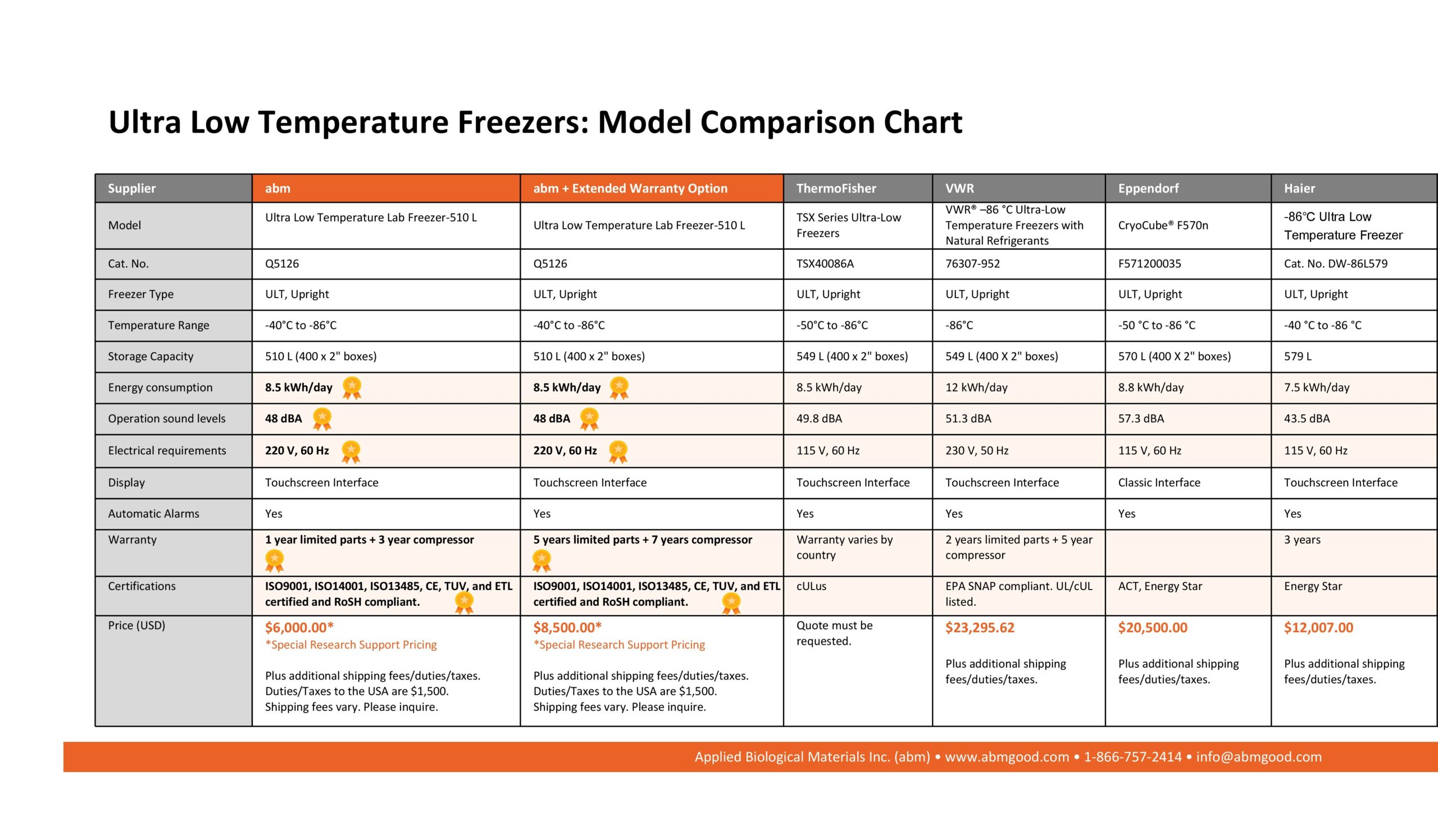
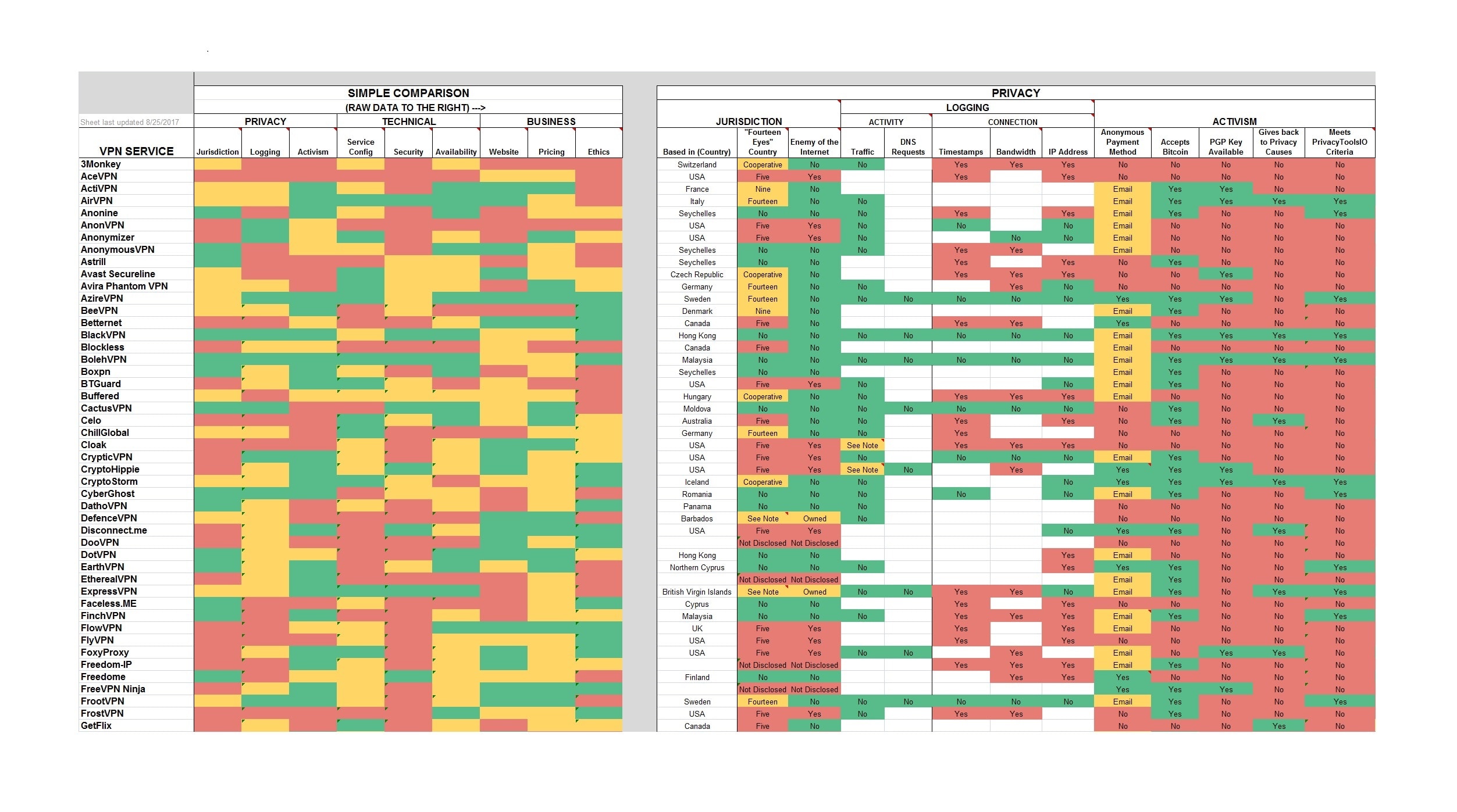
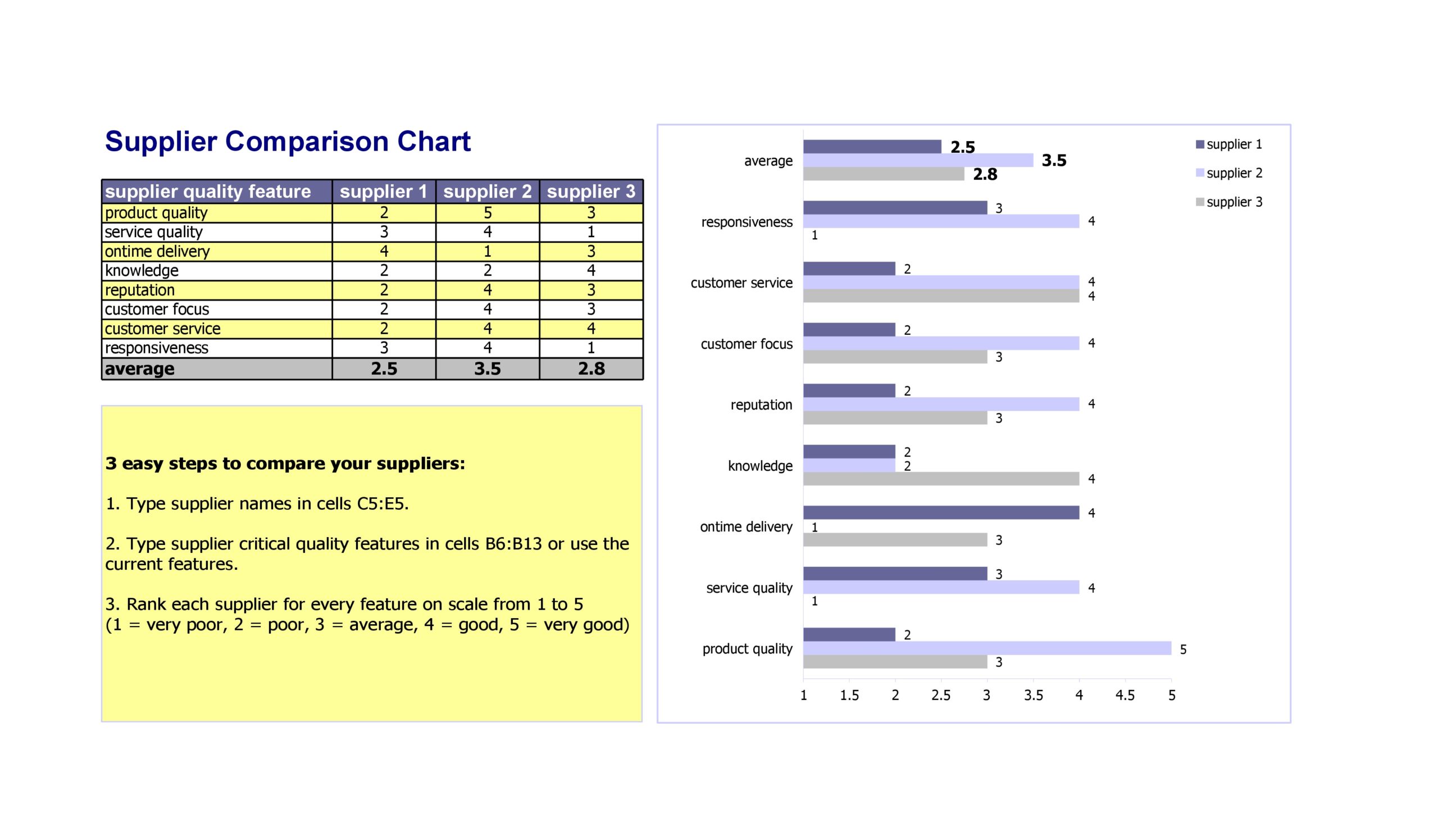
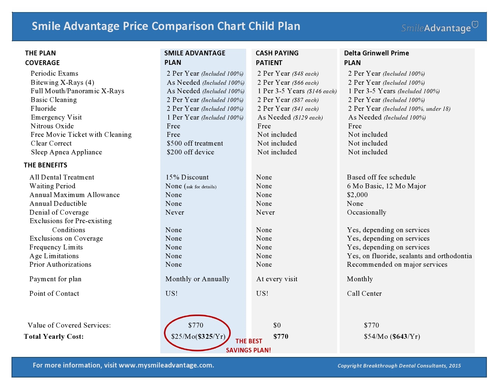
A comparison chart is used to compare various sets of data. It is a visual chart, also known as a comparison list or comparison graphic product. It contains both numbers and texts to help the user understand the information more easily. A comparison chart can be created using different types of applications. Some people use PowerPoint, but the commonest application used is Excel.
Types of data presentation
Visualizing data is not just about creating boards and visuals. You must learn to choose the best comparison table template to create an easy-to-understand data visualization. There are different types of data presentations that you can choose to use.
- Data distribution. Data distribution presentation helps display a wider range of information over a longer period. The presenter may distribute data over three months or even several years. The purpose is to help the people visualize it to have a clue of the outliers.
- Data comparison. This is a comparison list created within the same chart. The comparison graphic product contains multiple variables presented in the same or single variable. For example, the presenter can be comparing sales of different types of fruits within a given time frame. They can present, for example, something like:
- Sale of mangoes
- Bananas
- Oranges
- Apples
- Tangerine
- Berries
Each fruit can be presented with a bar. One side of the comparison table template can have the total fruits sold for each category. The other side can have different fruits. All the fruits and their quantities are presented in the same chart to help compare which fruit is selling more or bringing more profits.
- Data composition. Composition means different components being compiled together. A composition in writing presents different paragraphs, but they all make the complete text. In a data comparison chart, composition means different sets of data presented to make a complete picture of something. For example, the presenter can create weekly reports that consolidate a report for an entire year.
- Data relationship. Relationship in ordinary life means how closely people are connected. They can be in units of friends, nuclear family, extended family, citizens, students, etc. In the comparison table template, relationship means closely interconnected variables. The data compares one closely related variable with another.
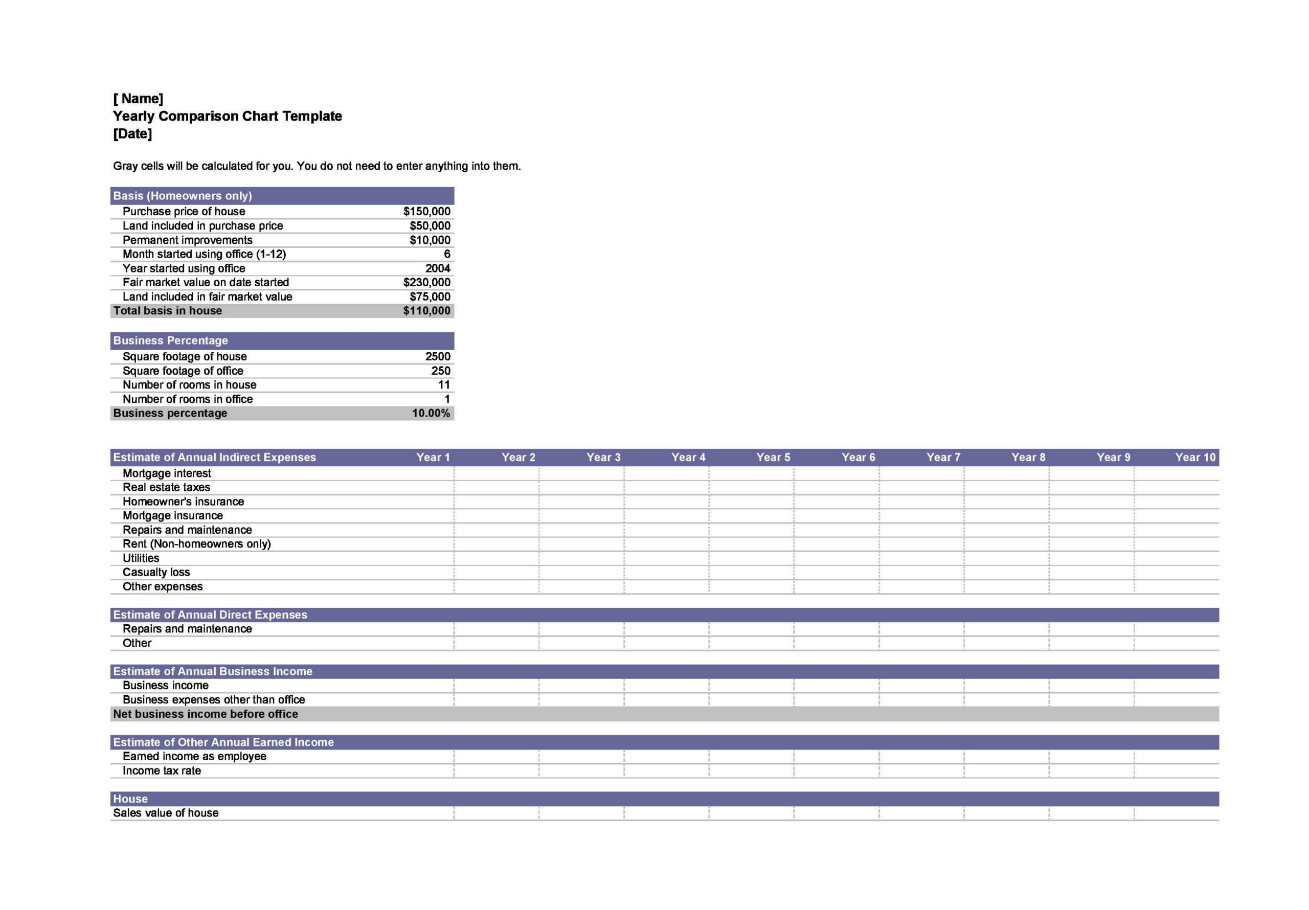
Comparison Table Templates

Different types of comparison charts
Considering the different data presentation types, there are different types of charts used for presenting data.
- Line charts. A line chart is a comparison list that presents data in a line or lines. Depending on the data at hand, the line sometimes ascends and descends at other times. It helps visualize data changes over a longer period.
- Column charts. A column chart is a comparison graphic product that uses vertical bars to present data. The chart is used to compare one type of data with another over time. The data can present two items or more.
- Scatter plot. A scatter plot is a comparison table template that presents data using dots. Usually, the data presented is random, including the variables, although the indicators connote each information point.
- Bar charts. A bar chart presents data in horizontal columns. They are commonly used when comparing a series of data values. The qualitative data is presented on the horizontal axis, while the specific data is presented on the vertical axis.
- Pie charts. A pie chart presents data in circular graphs. It is best used when presenting data in percentages. The pie is broken down into multiple segments, each presenting a specific variable.
Advantages of using a comparison chart
Comparison charts have been used for many years. They have been used in wide applications due to their multiple advantages.
Analyzing large data sets
A comparison list can be used to analyze a large data set and provide a visual representation of the information. A large number of thousands of data variables can be broken down in a comparison graphic product and presented in the simplest form.
A comparison table template is easy to use
- Charts are easy to use. Anyone can create and use the chart regardless of their qualifications. Once created, it becomes easy to read and interpret. Charts can be shared or distributed widely.
- It is easy to create: Creating a chart list is easy. The only hard part is filling in the data correctly. Once it is filled, the user easily generates the chart depending on the data presented. It can be used to present both qualitative and quantitative analysis.
- It is easy to compare: The reader can easily compare one variable with another in an instant.
- They have wide applications: Charts can be used under unlimited circumstances. They can be used to measure different weather patterns, population, business growth, learning differences, health statistics, etc.
Comparison Graphic

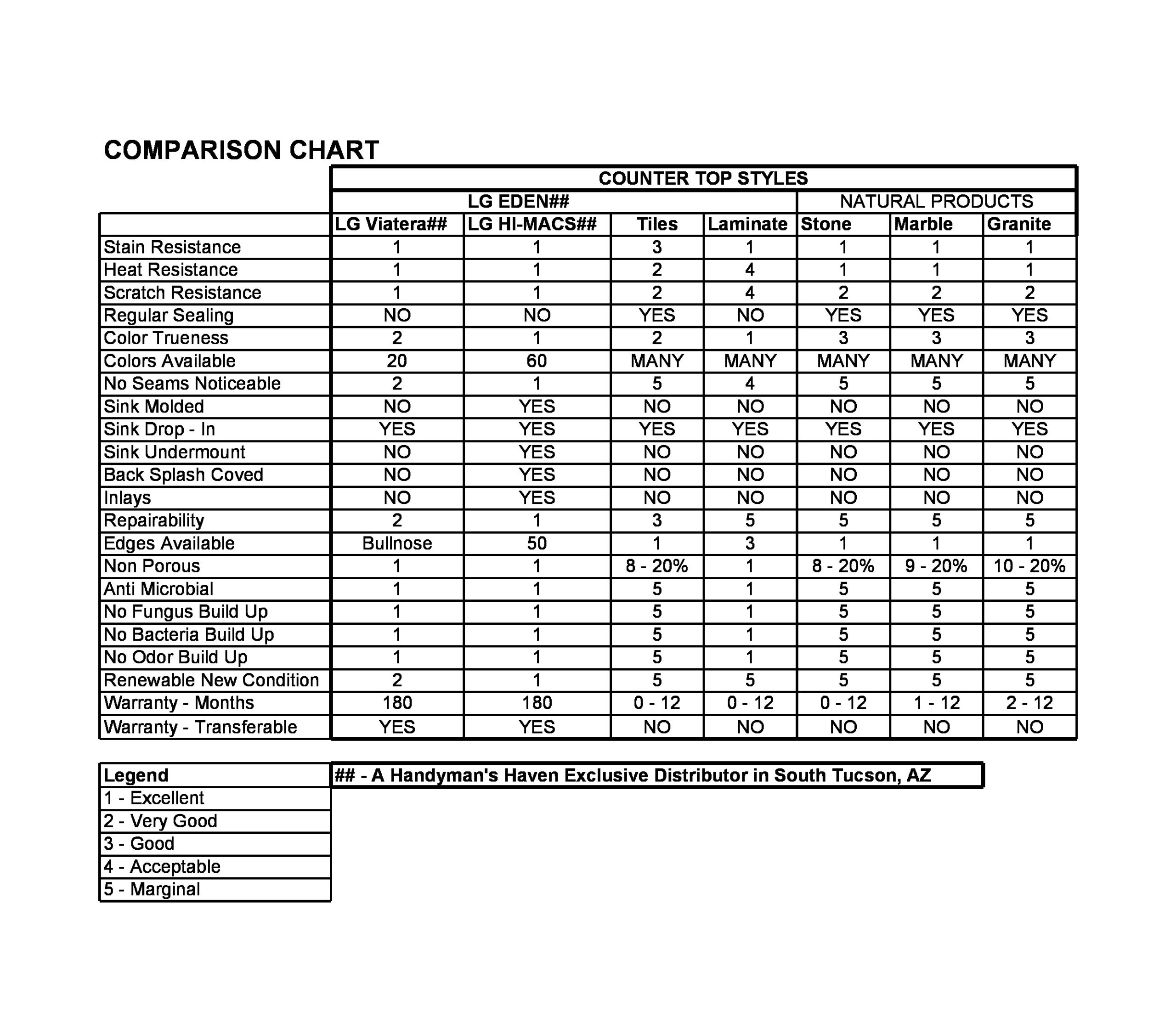
When is a comparison table template used?
A comparison table template can be used under various circumstances. It depends on the situation at hand or what type of data requires interpretation. Here are different circumstances under which a comparison graphic product can be used.
- When comparing two or more variables
- When analyzing how different products are performing
- When gauging the effects of specific product parameters
- When making critical decisions
- When seeking alternatives to specific issues
- When reviewing a situation under research
- When validating models or evaluating different possibilities.
What is the best comparison chart?
The best comparison chart depends on what is best for you. There are different types of comparison charts. Each type is best for a specific purpose. To help you decide which one is best for you, there are several questions that you might need to answer first.
- Decide the total variable you want to be included in one chart. You might decide you want one, five, ten, or many variables in the same chart.
- Decide the total items that you want to be displayed per variable. For each variable, you may want to display five items, fifty, one hundred, or several thousand.
- Decide how you want the values displayed. They can be displayed over a longer period, can be grouped, or displayed within the various items. When you answer these questions correctly, you will be able to easily choose the best comparison chart for your need. Here are examples of choices that you can make.
- When creating comparisons, choose bar charts as the best
- When creating trends, choose line charts
- When analyzing relationships or distributions, choose the scatter charts
- When creating percentages or compositions, choose pie charts
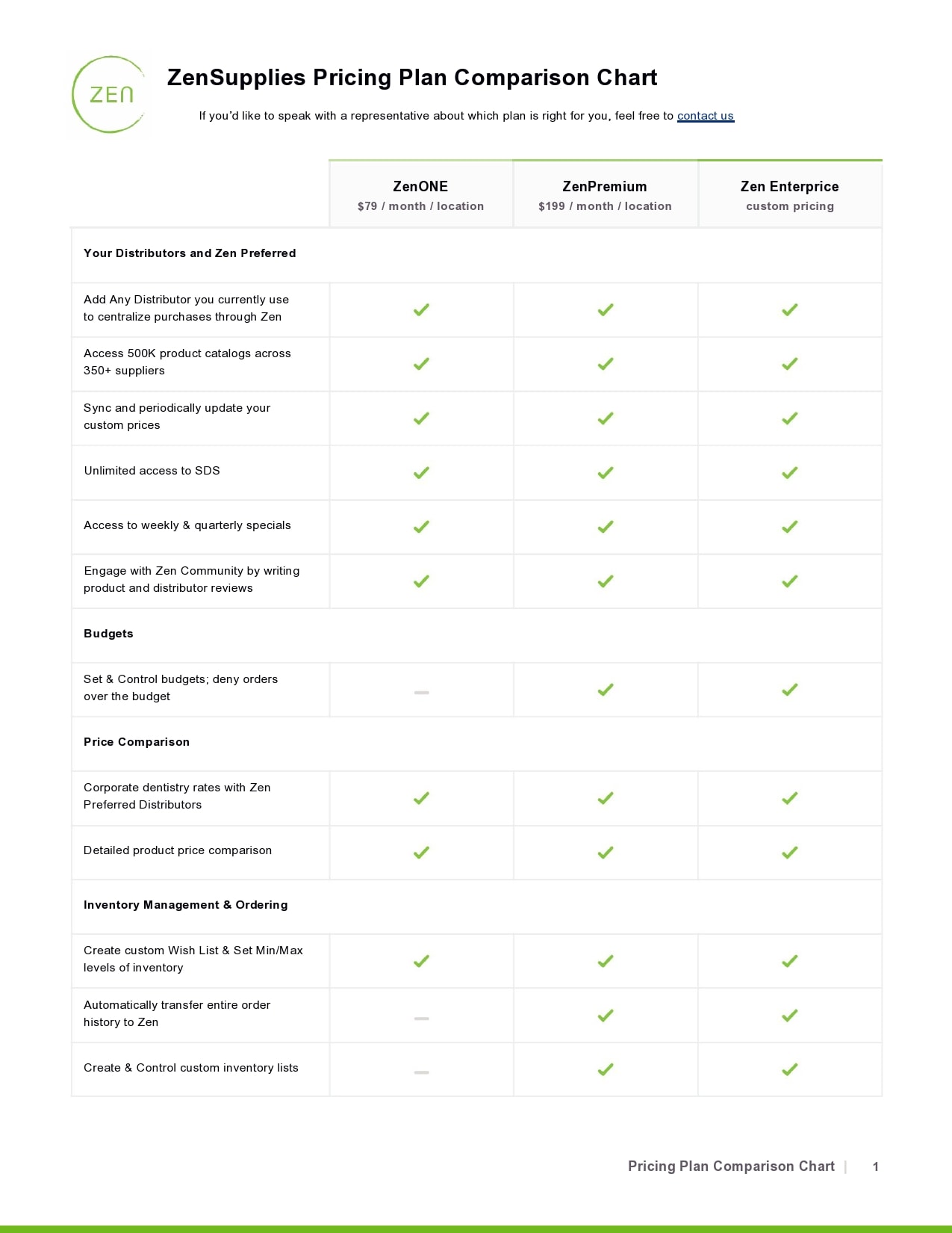
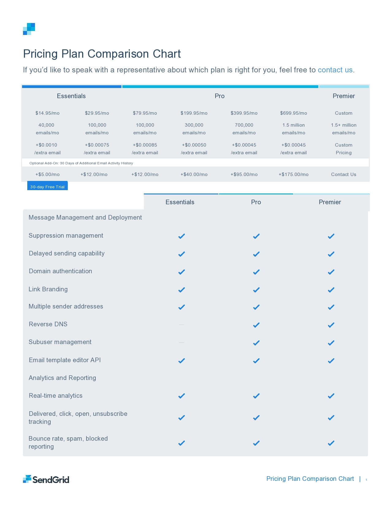
Product Comparison Charts


How do you create a comparison chart?
There are different methods for creating a comparison chart. It depends on the data that you are capturing and how you want it displayed. Here is the most common method for creating a comparison list.
Open a comparison table template
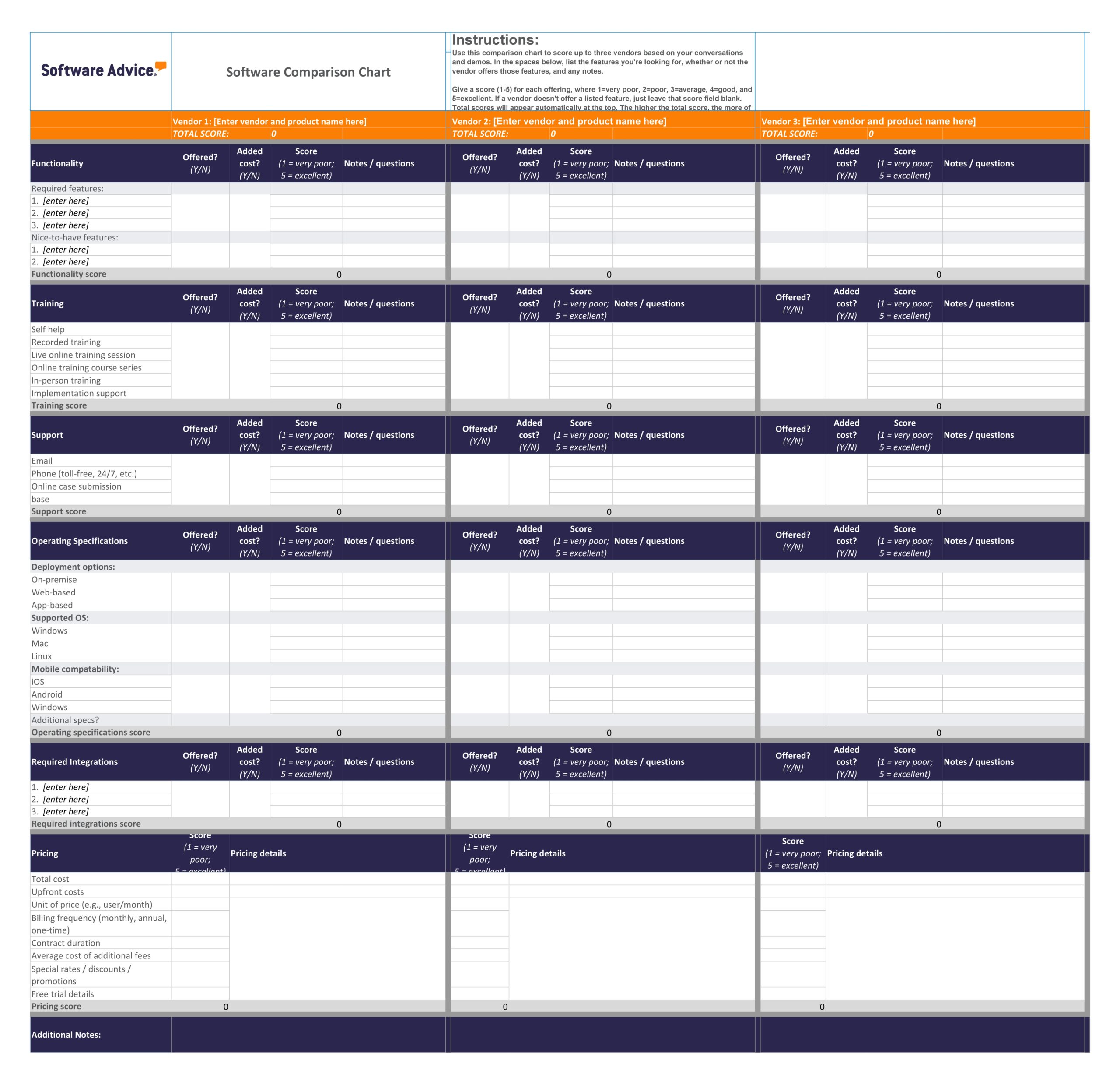
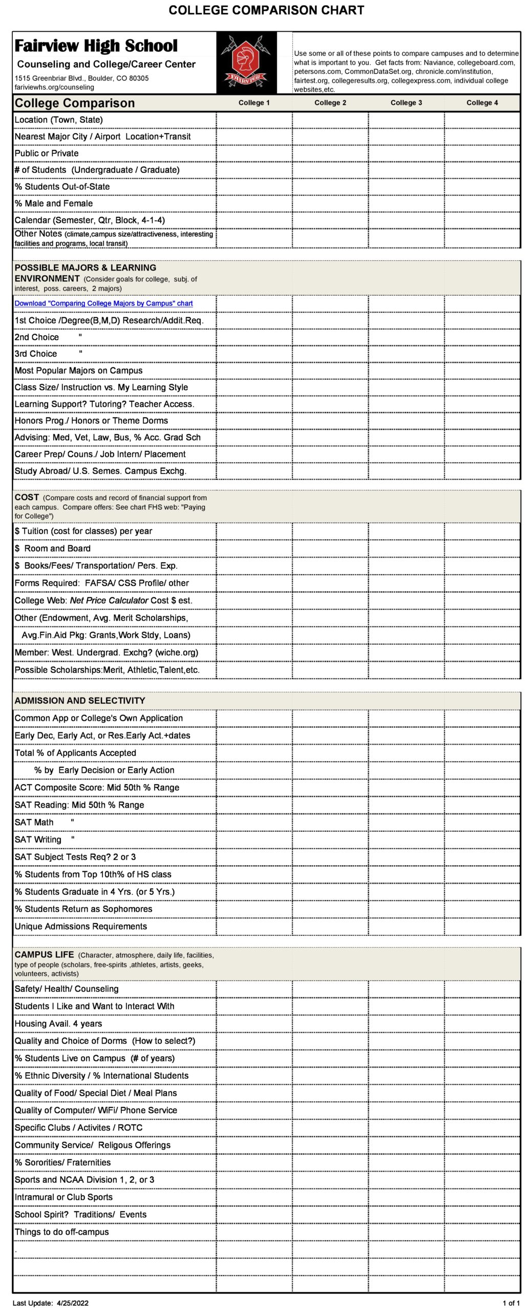
You can download a comparison table template online. Most of the templates look like an excel sheet. They are already customized with various lists. All that you need to do is to enter your variables to generate the sheet. Open a new comparison chart and proceed to the next steps.
Fill in the data
You should already have the data ready with you. Separate it such that you will have numerical data going to the vertical axis and text data going to the horizontal axis. This can change when creating a different type of chart.
If possible, copy and paste data from a different file. You can also choose to enter it manually, one item at a time. Another way is to import data from another file into the comparison chart template. After entering all the data, highlight or select it.
Create the comparison chart
- The comparison table template might have the comparison charts built. If it is lacking, you need to build it. How you build it depends on the application you are using. For example, if you are using Excel, follow these steps.
- Go to the home tab
- Click the border icon
- On the drop-down menu that opens, select all borders
Each cell will be highlighted. You can also create by clicking the Insert tab and then table.
Customize your comparison chart
The above procedure creates a basic excel comparison table. Your next step is customizing the chart to fit your needs. There are many formatting features in Excel that you can use to customize your chart. Here are some of the interactive features.
- The font feature is used to change fonts
- The images feature is used to add images or watermark
- The color feature is used to change font colors, variables colors, chart colors, etc.
These features are available on the home tab and the inset tab. To add more details or information, follow these steps.
- Go to the home tab
- Click on borders
- Click on more borders and add more information as you wish.
Save your comparison chart
You have completed creating your comparison chart. Your next step is to save the chart lest you lose all the information. To save the chart, follow these steps.
- Go to my file
- Click on save
- A window will open on the screen
- Give a name to your chart
- Choose the place where you want to save the chart
- Click Save. Your chart will be saved for easy retrieval the next time you need your chart.
Rules for data visualization
To make your comparison chart easy to read and comprehend, keep these rules in your mind.
Use of colors
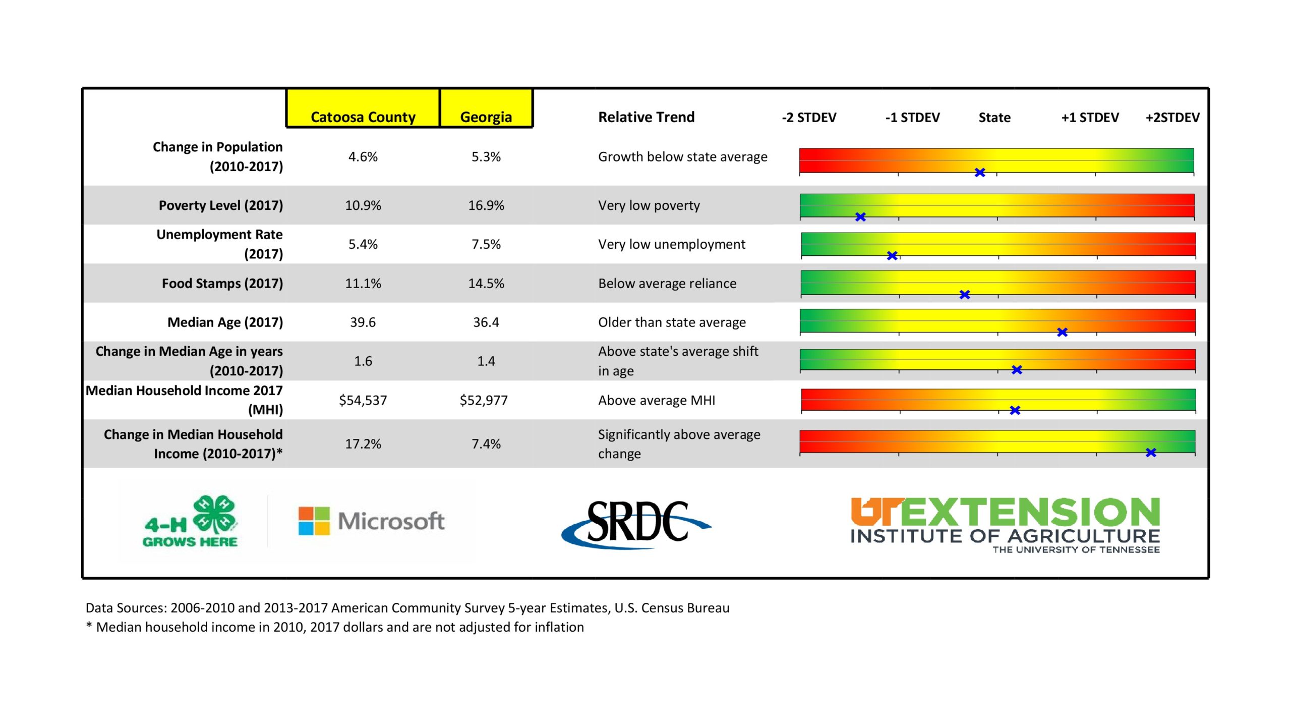
Charts are easy to understand if you separate different variables with different colors. However, you should never use over six colors in a single chart. The chart will look too complex for interpretation by the brain. If you want to compare the variable over different times, do not use two different colors. Instead, use the same color but change its intensity. You can make it darker at some points, lighter, medium, etc. However, you should use different colors for each different variable.
For example, if you have five variables in the same chart, you can use five different colors yellow, pink, brown, orange, and black. Let the colors in the charts be consistent. For example, if you choose to use red, green, and yellow, stick to these colors in your charts that are comparing the same variables. Unless you are working on a different type of project, changing colors might make the user think you are presenting an entirely different field.
Test the charts to see how the colors will be distinguished when printed in black and white. Click on the print and then select greyscale. If you cannot distinguish the colors, you should change them. This action helps to make sure a color-blind person can differentiate between different variables.
Setting time axis
Always set the time axis on the horizontal side. Time progression should run from the left side going to the right side. If you notice any periods that have values under them, do not skip them. They are crucial in data presentation.
Dealing with complex data
Your comparison chart will look confusing if you add too much data. Once you create the comparison chart, the data will look too complicated to comprehend. It is better if you split the data and create two or more separate charts. Highlight variables, change colors and make it look simple. The human mind cannot be able to read too complex data.
Sorting out variables
You need to sort out different variables so that the reader will easily understand. For example, when using columns and bars, do not sort them out alphabetically. Instead, sort it out using an ascending or descending order.
Let values be proportional to the numerical quantities
Charts use number values and text presentations. To avoid confusion, let each numerical value be aligned with the quantities it presents. For example, if the text indicates total births in January and the numbers indicate 10,000, that value should be what was achieved in January and not in May.

")
")